Sherwin Williams 2024 Colors – 48 hues you’re going to love
Are you curious to see what the paint color trends for 2024 are going to be? Here are the newly-released Sherwin Williams 2024 colors with pictures and best uses, and you’re going to love them!
This post contains affiliate links for your convenience. I may make a small commission on products purchased with my link, but your price does not change. For full disclosure go here: Disclosure and Policies. Thank you for supporting my site.
Sherwin Williams 2024 Paint Colors – Anthology
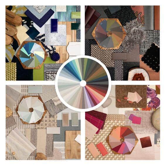
Every year in August Sherwin Williams releases their ColorMix forecast for the upcoming year. It’s always interesting and exciting to see the colors that are chosen to be featured.
See all the 2024 Color of the Year pick (so far) from the major paint companies here: 2024 Paint Color of the Year Picks
This year’s collection is a little different than previous years. It kicks off the start of a biennial collection of colors, meaning that we’ll be seeing trends twice a year now instead of only once.
See the color trends from previous years:
- 2023 Sherwin Williams Paint Color Trends
- 2023 Benjamin Moore Paint Colors
- 2022 Benjamin Moore Paint Colors
- 2022 Sherwin Williams Paint Colors
- 2021 Benjamin Moore Paint Colors
- 2021 Sherwin Williams Paint Colors
- 2020 Benjamin Moore Paint Colors
- 2019 Benjamin Moore Paint Colors
- 2019 Sherwin Williams Paint Colors
Just released – the Benjamin Moore 2024 Color of the Year and Trends
The colors in the 2024 collection are centered around nature and well-being and are grouped into color families instead of themed palettes.
See which one of these colors was chosen as the 2024 SW Color of the Year here >> Sherwin Williams 2024 Color of the Year
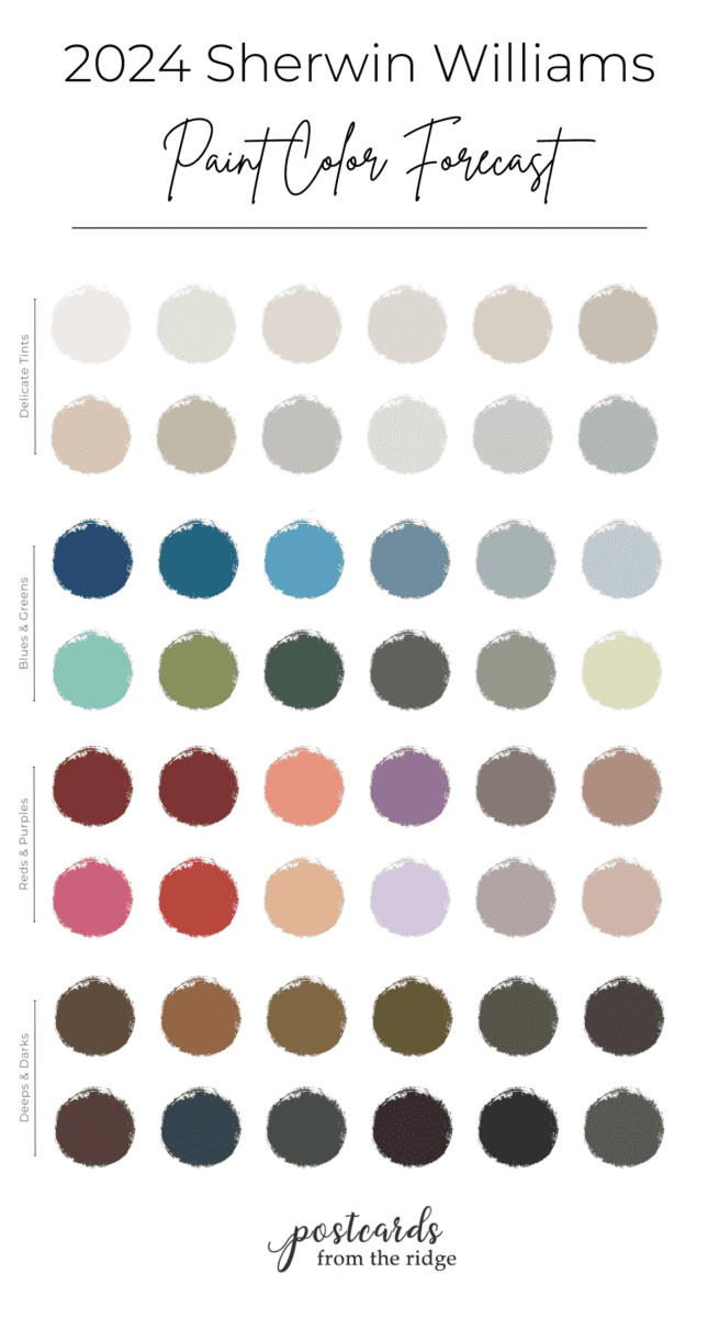
There are four distinct curated palettes curated from their best colors:
- A Gathering of Deeps & Darks
- The Poetry of Reds and Purples
- The Convergence of Blues and Greens
- A Study in Delicate Tints
Today we’ll take a deep dive into the colors and see all four palettes. Many are shown in real rooms so you can get a sense of what they might look like in your space.
Grab a beverage and get comfy while we tour these 48 gorgeous hues.
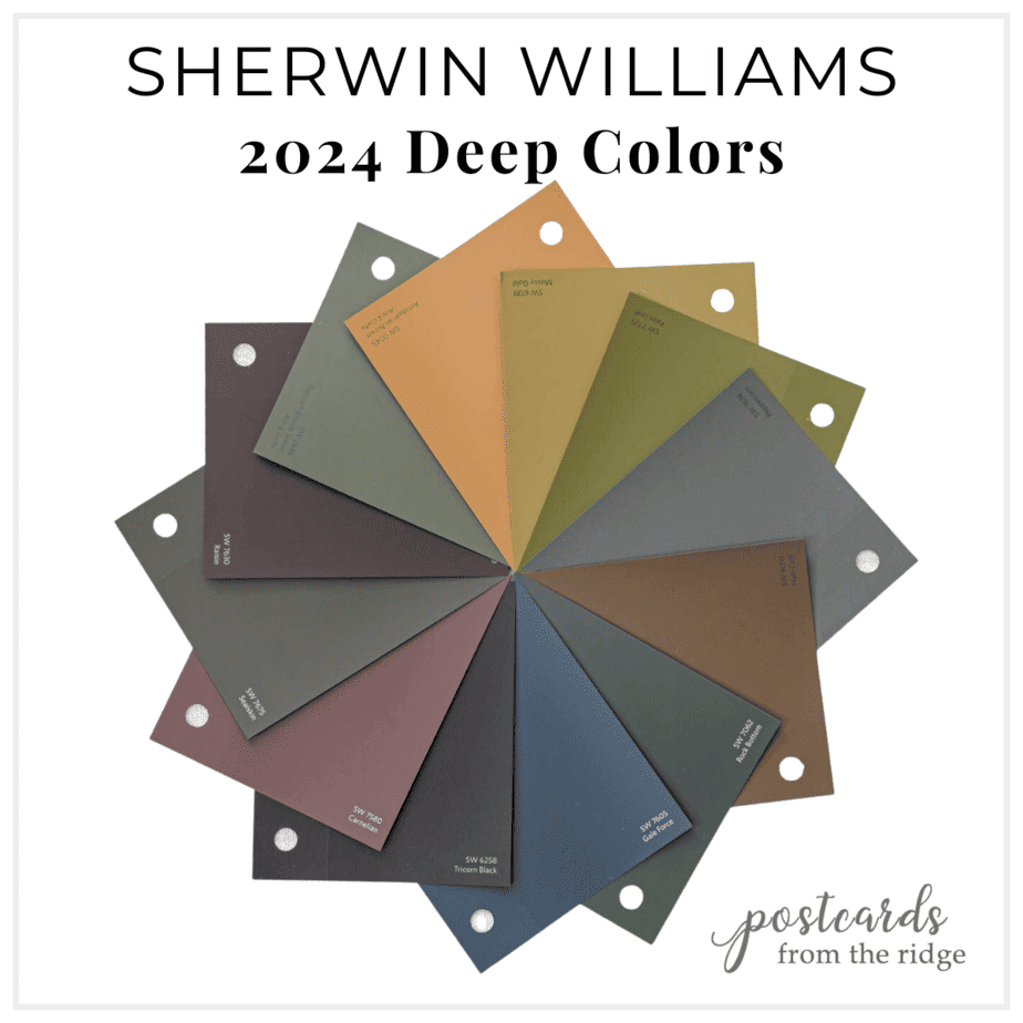
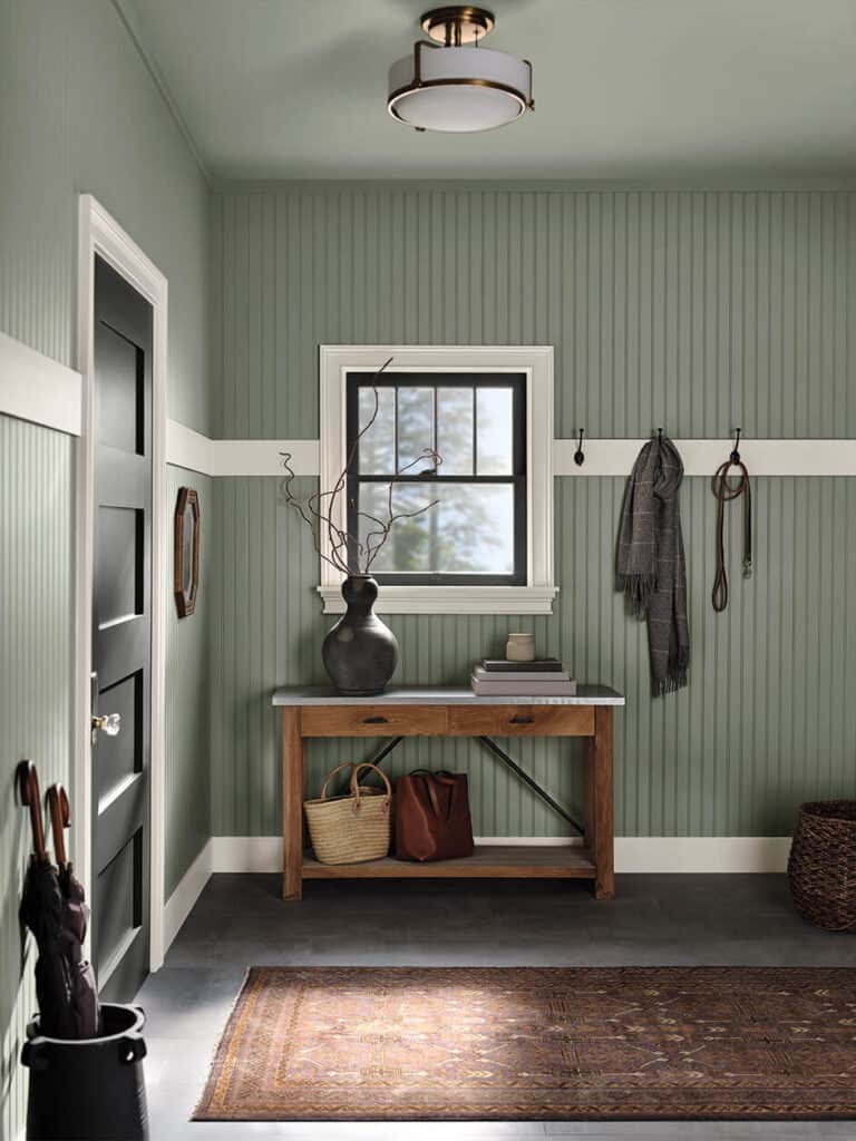
Sherwin Williams 2024 Colors – Deep & Dark
First up is the Deep and Dark palette. And there’s no need to be afraid of these dark colors.
Actually, using a dark paint color in your home will create a sense of well-being and will be less visually stimulating. It will allow you to focus on your inner self and make your home feel like a sanctuary.
“Escape into a restful retreat with this palette of deep, dark colors. A range of dramatic hues that introduce powerful contrast and a little mystery.”

Grab a free downloadable chart with names at the bottom of this post.

Try a sample
Here’s a list of all the colors from the “Deep & Dark” collection and you can click on any name to get a peel and stick sample. Or get the entire collection here: SW 2024 Deep and Dark Colors
- A-Half Caff SW 9091
- B-Antiquarian Brown SW 0045
- C-Mossy Gold SW 6139
- D-Palm Leaf SW 7735
- E-Roycroft Bronze Green SW 2846 (peel and stick sample not available at this time)
- F-Sealskin SW 7675
- G-Carnelian SW 7580
- H-Gale Force SW 7605
- I-Rock Bottom SW 7062
- J-Raisin SW 7630
- K-Tricorn Black SW 6258
- L-Peppercorn SW 7674
I strongly recommend looking at any color in your specific lighting conditions before purchasing your paint. The peel and stick paint samples are my favorite because they’re painted with 2 coats of real paint, are repositionable, and are shipped overnight. Plus you don’t even have to wash out a paint brush!
Colors look different in reality than they do on your phone or computer screen so don’t take a chance by not testing it first!
It’s also helpful when you can see how a color looks in a room so you can get an idea of how it might look In a larger area. Here are several of these gorgeous deep colors.
Gale Force SW 7605
“This moody, dark blue will wrap you in its cool, saturated embrace. Pair with a warm taupe to soften its power or with a cool white to help it stand out.“
This stunning deep muted blue has an LRV 6 and will give your room the feeling that you’re nestling inside a cocoon. Perfect for a bedroom or any room you want to relax. Use light natural wood tones, creamy whites, and browns with this beautiful color.
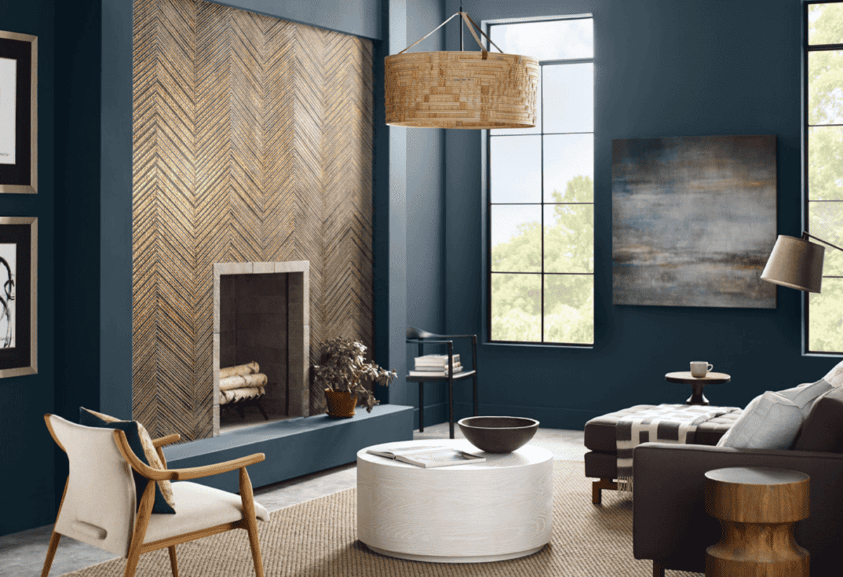
Get a sample here >> Gale Force SW 7605 peel and stick sample
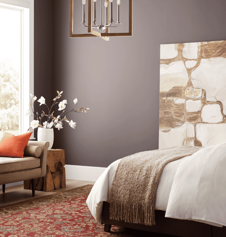
Raisin SW 7630
“With classic sophistication, this dark brown gives your space an elegant poise. Its purple undertone allows it the versatility to pair well with most colors.“
Deep and velvety, this luscious hue is sophisticated and cozy all at the same time. It as an LRV of 3 which indicates that it’s very dark. Use it with dark accent colors for extra drama.
Grab a sample here >> Peel and Stick Sample Raisin SW 7630
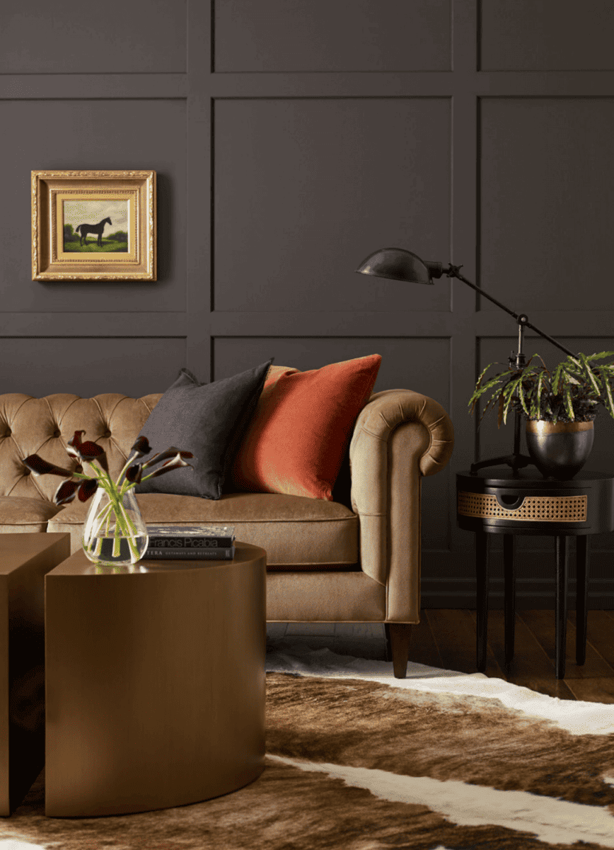
Rock Bottom SW 7062
“This dark green-gray hue is moody and cool. Bring out its mossy undertones by pairing it with Silver Strand or Reserved White.“
This deep charcoal hue is not quite black but is very dark with an of LRV 7. It looks perfect with light woods and tomato red accents in this setting.
Get a sample here >> Rock Bottom SW 7062
Sealskin SW 7675
“A deep, bold brown, this color will wrap you in its heavy, warm embrace. Consider this dark hue in a well-lit living room or study.“
If you want an ultra deep color but blacks are just a bit too cold for your liking then consider Sealskin SW 7675. It’s a little warmer than a true black but has the same moody qualities. It has an LRV of 6 and is still very dark.
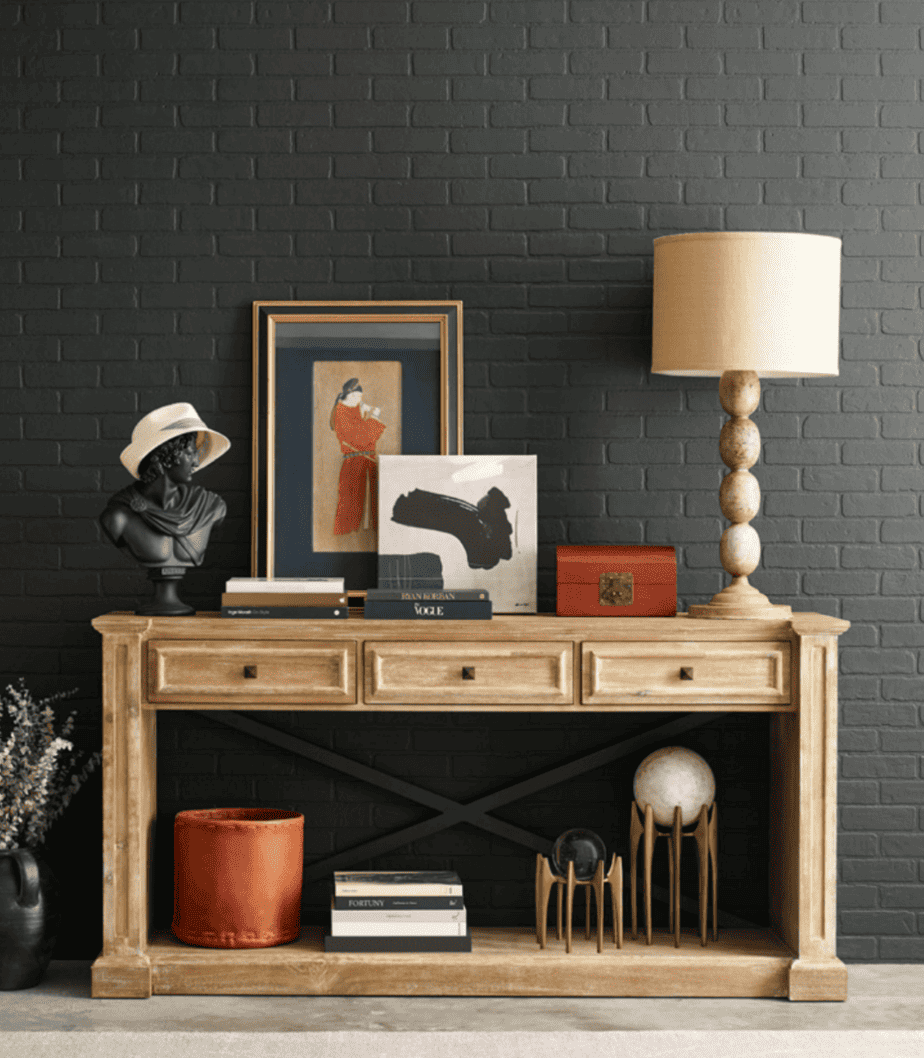
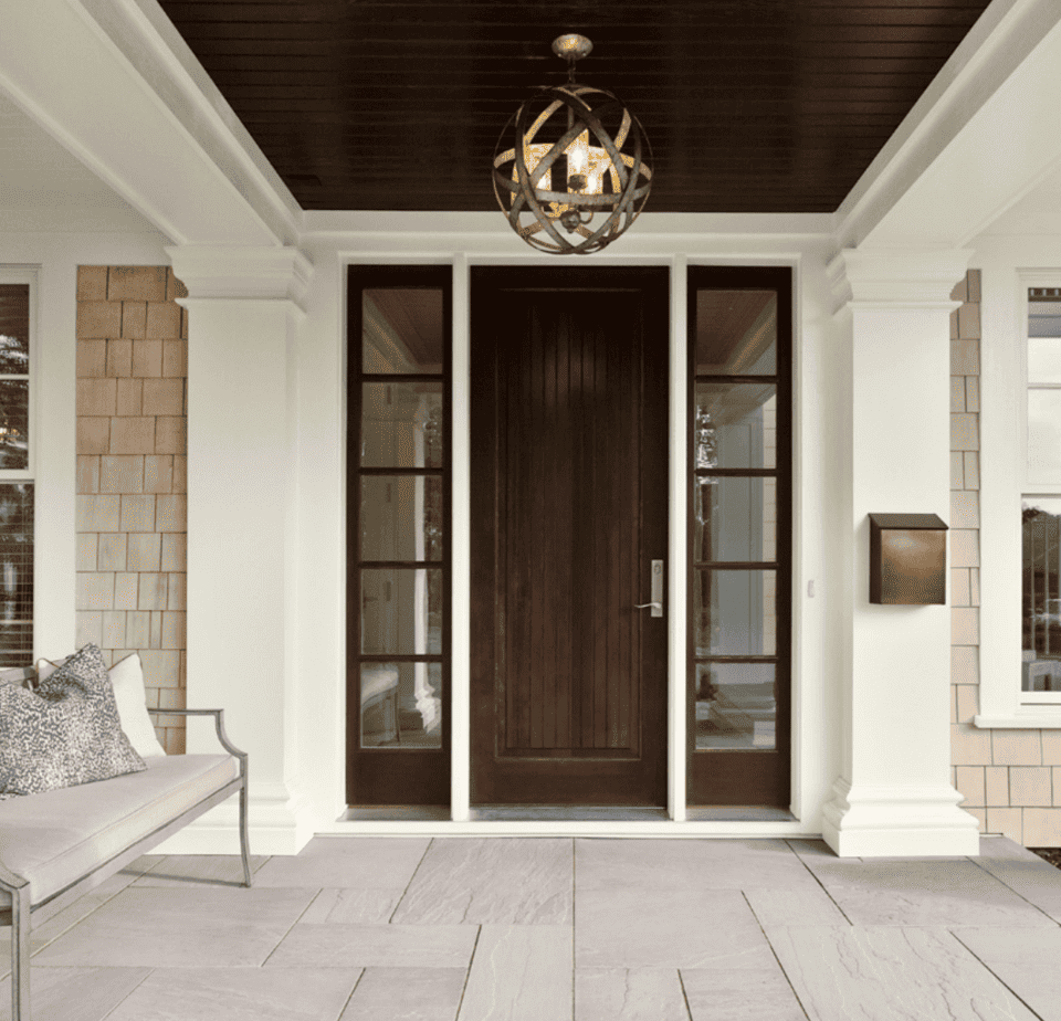
Tricorn Black SW 6258
“Smarten up your space with this trendy, never-boring black. Pair it with white for a classic contrast. Since it’s a true black, it works with any undertone.“
Tricorn Black SW 6258 is one of the Top 50 Colors from Sherwin Williams and is their most popular black paint color. Our own front door paint color is this hue and it’s a true black. It has an LRV of 3 and is about as dark as you can get with paint.
Get a sample here: Tricorn Black SW 6258 peel and stick sample
Antiquarian Brown SW 0045
“A welcoming cinnamon brown with hints of ginger and gold, this hue is right on trend and will continue to endure the test of time.”
This cozy warm brown color is part of the Arts & Crafts palette from the Historic Collection. It has yellow/orange undertones that keep it from being too dark. Pair it with black, tan, and creamy white. The LRV is 16.
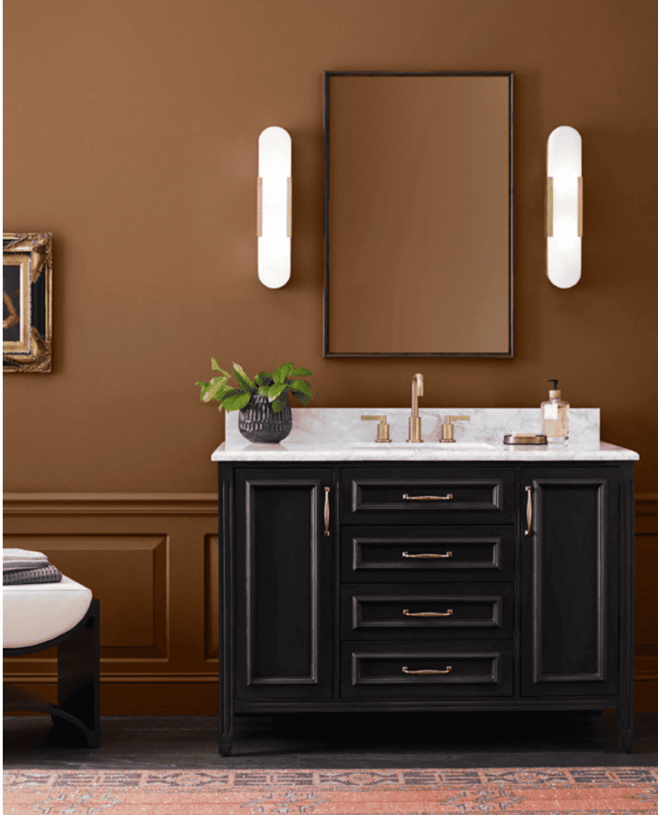
Get a sample >>Antiquarian Brown SW 0045 peel and stick sample
Tips for choosing paint colors
Read my tips for finding the right paint color here: How To Choose the Right Paint Color
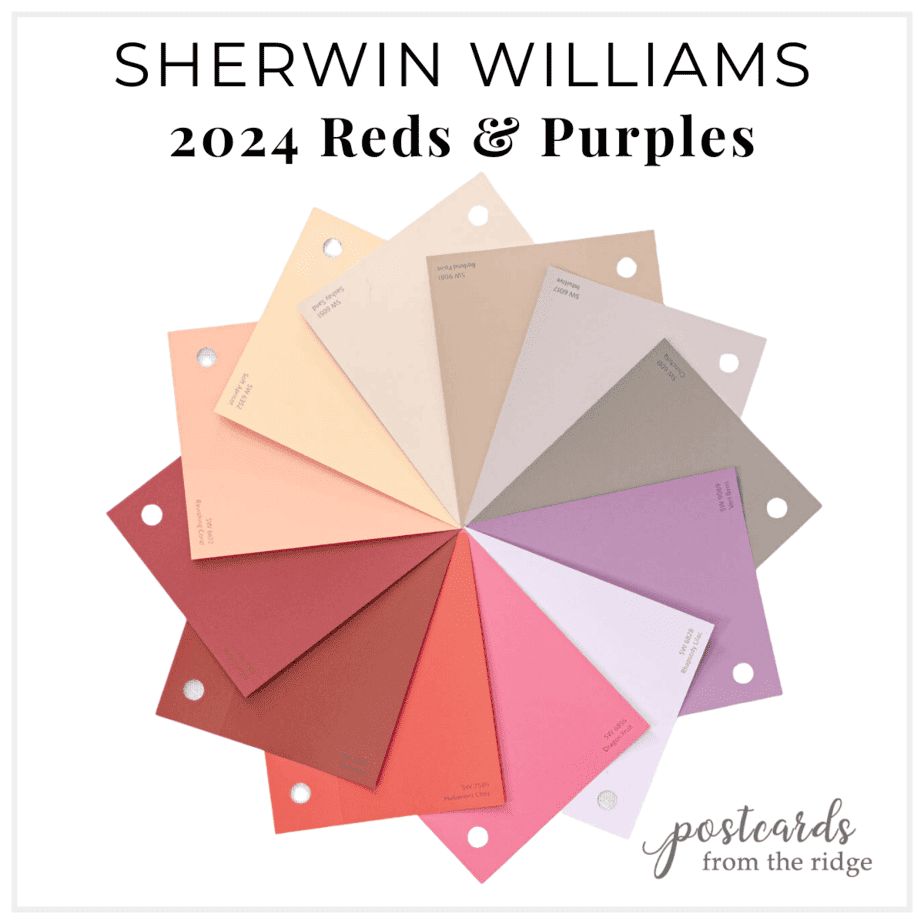
Sherwin Williams 2024 Colors – Reds & Purples
“Ravishing reds and purples put on a dynamic display, with warm crimson, soft blush and beige, sweet purples, and nostalgic pops of cheerful color. Balanced by the growing popularity of natural clay and baked pigments, this palette leans muted yet expressive.“
Colors have been trending towards warmer hues recently and this collection features some red hot ones. Purple is becoming more mainstream and there are 4 in this palette. The vibrant reds are full of energy and would add a punch to any space.

Grab a free downloadable chart with names at the bottom of this post.
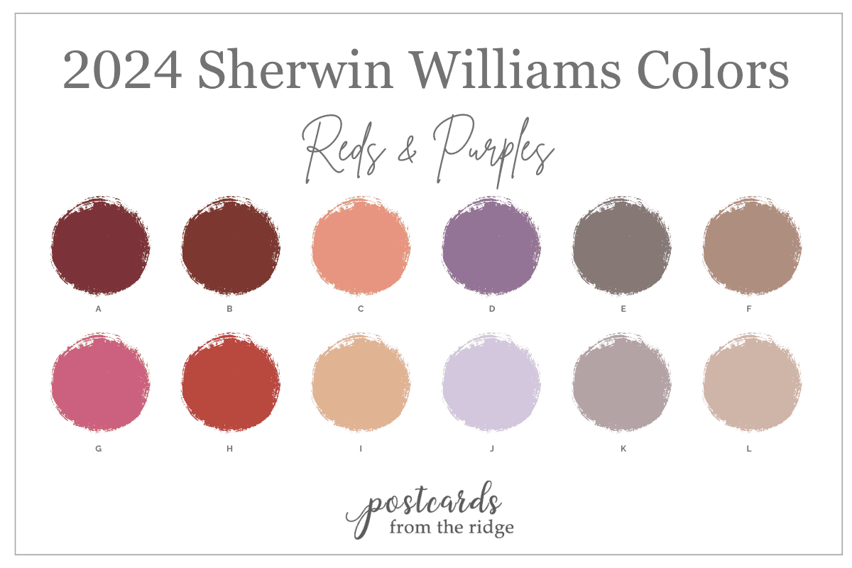
Click on any name below to get a peel and stick sample of the color. Or get them all here: SW 2024 Reds & Purples
Fireweed SW 6328
“Expect a pleasing kind of warmth with a trend-forward mineral and earthy character in this rust- and brown-toned red.”
This deep, warm red is part of the West Elm Sherwin Williams color collection and has a bit of rusty undertones. It has a richness to it that would make it perfect for a dining room, powder room, and accent wall. The LRV for this color is 7, so it’s considered to be a very dark color.
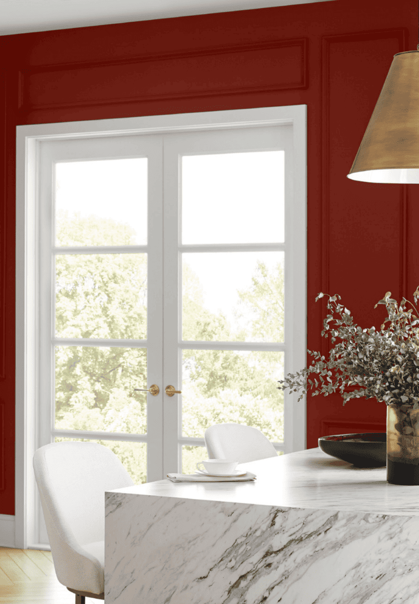
Get a sample >>Fireweed SW 6328 peel and stick sample
Dragon Fruit SW6855
“A botanical hue for the bold, this truly sumptuous and saturated pink is ripe for the picking and as thrilling as the feeling of falling in love”
Pink has been coming on strong lately in home decor and paint colors. A personal favorite of mine, it’s perfect for adding a bold punch of color and personality. It has an LRV of 23.
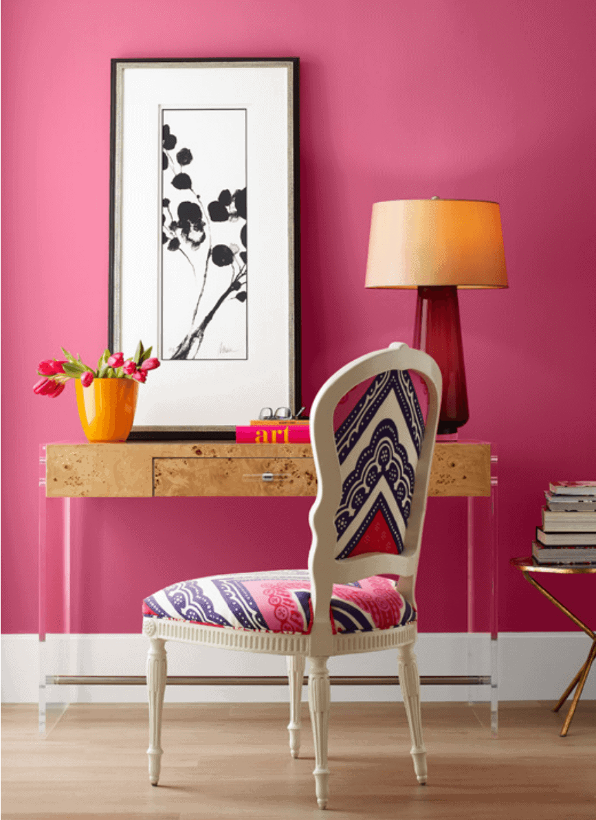
Get a sample >> Dragon Fruit SW 6855 peel and stick sample
Wild Currant SW 7583
“This luscious medium-dark wine red brings full-bodied depth and well-roundedness into comfortable yet elegant spaces.”
This deep red is cooler than the Fireweed that’s also in this palette. It has slight blue undertones and an LRV of 7. Use this elegant color in a dining room, entry, or half bathroom to add a sophisticated look.
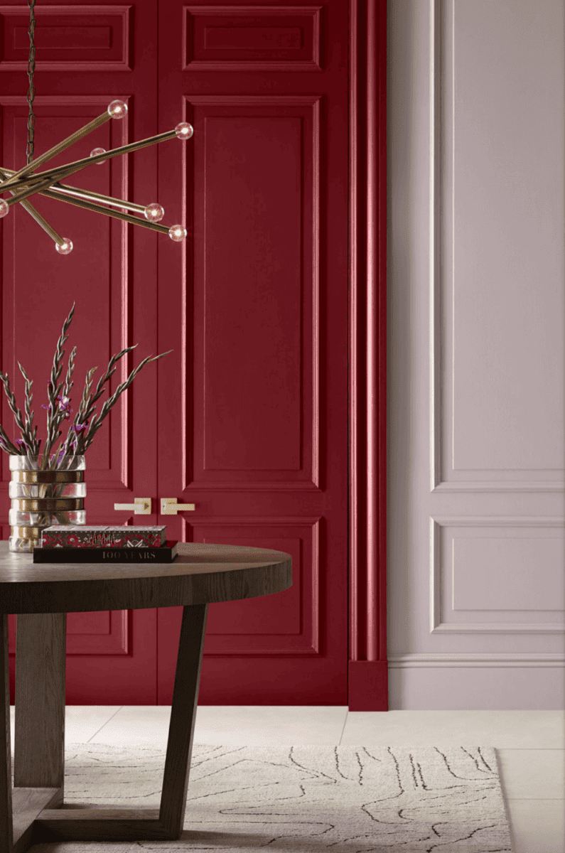
Get a sample >> Wild Currant SW 7583 peel and stick sample
Guide to Paint Gloss
Learn all about paint gloss levels and where to use each one here: Ultimate paint Sheen Guide Printables
Sashay Sand SW 6051
“A light-to-medium beige with the subtlest pink undertones, this blushing neutral embodies the rising popularity of natural pigments.”
Here’s a throwback to the 80’s that’s actually pretty. Sashay Sand falls in between rose and beige colors and has a warm, earthy quality to it. The LRV is 49.
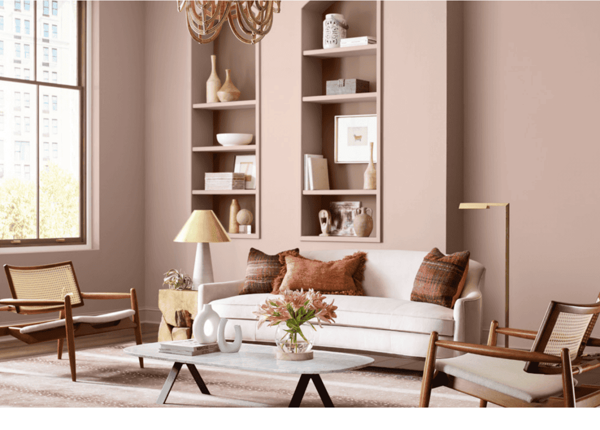
Get a sample >> Sashay Sand SW 6051 peel and stick sample; Back of bookcases: Redend Point SW9081
Intuitive SW 6017
“This gauzy purple-gray is a stabilizing neutral with a subtly shifting quality that reflects and complements its surroundings.”
Intuitive has a heathered lilac hue and an LRV of 38. It’s a cool medium depth hue that has a subtle elegance to it. Warm wood tones, creamy whites, and caramel leather look perfect with it.
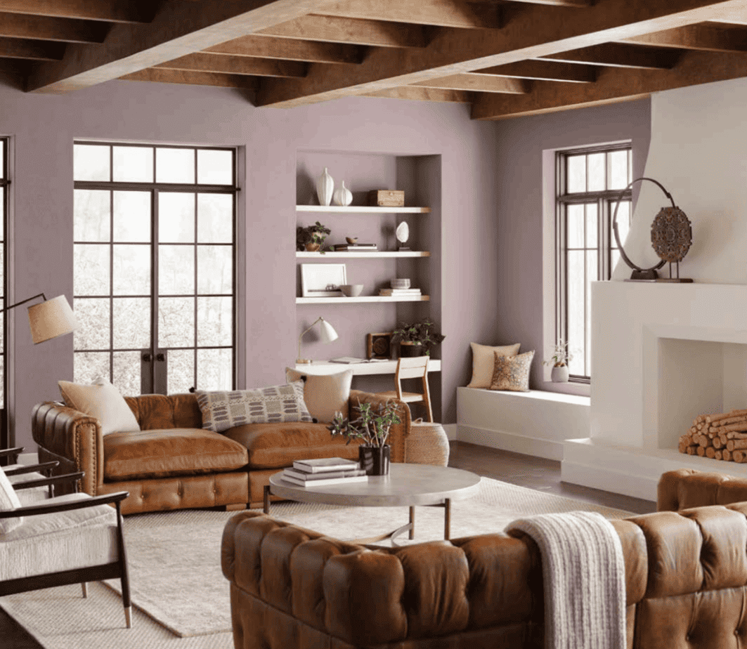
Get a sample >> Intuitive SW 6017 peel and stick sample
Chinchilla SW 6011
“For a cozy color choice in virtually any setting, cuddle up to this lovable and extraordinarily soft purplish-gray hue”
Chinchilla is is a moody, gray purple with an LRV of 20. Use it in rooms that face west or south to keep it from looking too cold. Pair it with warm wood tones, cool whites, and pops of orange for a stylish look.
Get a sample >> Chinchilla SW 6011 peel and stick sample
Rhapsody Lilac SW 6828
“Perfect for conveying the light loveliness of new blooms, this hushed purple shade is delicate, uncomplicated, and endearing.”
Lively, energetic, and fresh is a good way to describe this fun color. It’s feminine and fun and would add a spark of life to any space. The LRV is 60.
Get a sample here >> Rhapsody Lilac SW 6828 peel and stick sample
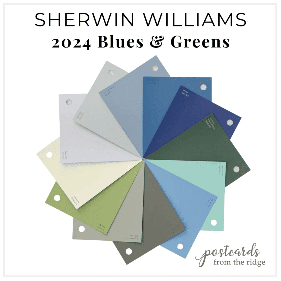
Sherwin Williams 2024 Colors – Blues & Greens
Blues and greens have the ability to instill a sense of tranquility, promoting calmness and a clear state of mind. In addition to being visually appealing and versatile, they also promote health and well-being.
“This palette revolves around a central color connection, blending and dispersing across a broad range of organic, calming-yet-invigorating gray-blues, bluish-greens, and everything in between. Find crystal clarity and harmonious natural influences.“
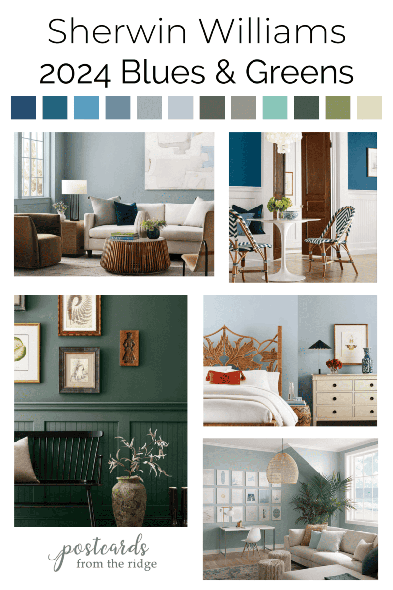
Grab a free downloadable chart with names at the bottom of this post.

Here are blues and greens from the Sherwin Williams 2024 collection. Click on any name to get a peel and stick sample of the color. Grab the entire collection here: SW 2024 Blues & Greens
- A-Indigo SW 6531
- B-Georgian Bay SW 6509
- C-Jacaranda SW 6802
- D-Smoky Azurite SW 9148
- E-Stardew SW 9138
- F-Upward SW 6239
- G-Aquastone SW 6043
- H-Leapfrog SW 6431
- I-Billiard Green SW 0016
- J-Pewter Green SW 6208
- K-Evergreen Fog SW 9130
- L-Honeydew SW 6428
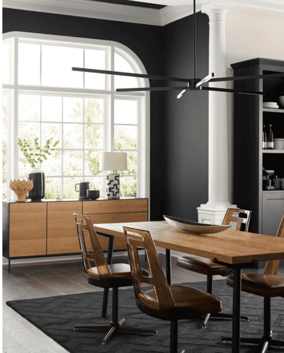
Georgian Bay SW 6509
“This deeply placid teal with a tinge of cool cerulean pairs elegance with tranquility and is richly inviting in any type of lighting”
You’ll feel like your floating on blue waters with this stunning blue color on your walls. It leans a little teal and looks amazing with brown wood tones and spring greens, as shown in this eating area. The LRV is 11, so be sure have plenty of light wherever you use this color.
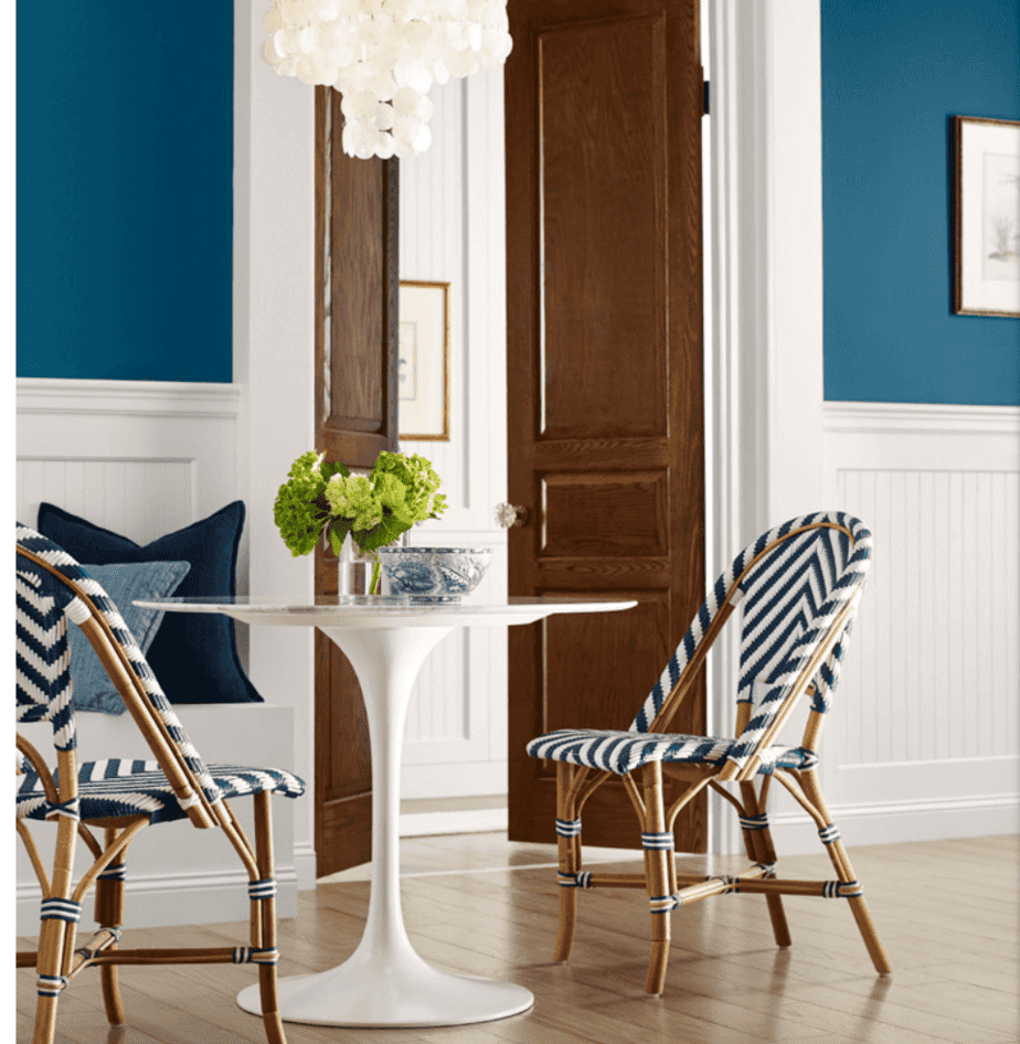
Get a sample >> Georgian Bay SW 6509 peel and stick sample
Pewter Green SW 6208
“For a naturally restful color that is down to earth, this steely fusion of gray and green is a groundedyet-elevated take on a modern dark neutral.”
The dark, cool, and earthy green is ideal with warm wood tones and natural colors like Shoji White. It’s a bold choice for this ceiling and looks great in restful bedrooms, dining rooms, and bathrooms. The LRV is 12.
Get a sample >> Pewter Green SW 6208 peel and stick sample
Evergreen Fog SW 9130
“Our 2022 Color of the Year is a cool and soothing gray-green chameleon color that is peaceful, composed, and subtle enough to use anywhere.”
The color of the year for 2021, Evergreen Fog is a winning color for any room. Use it with Alabaster trim for a classic look, or black for a modern appearance. The LRV is 30.
Get a sample >> Evergreen Fog SW 9130 peel and stick sample
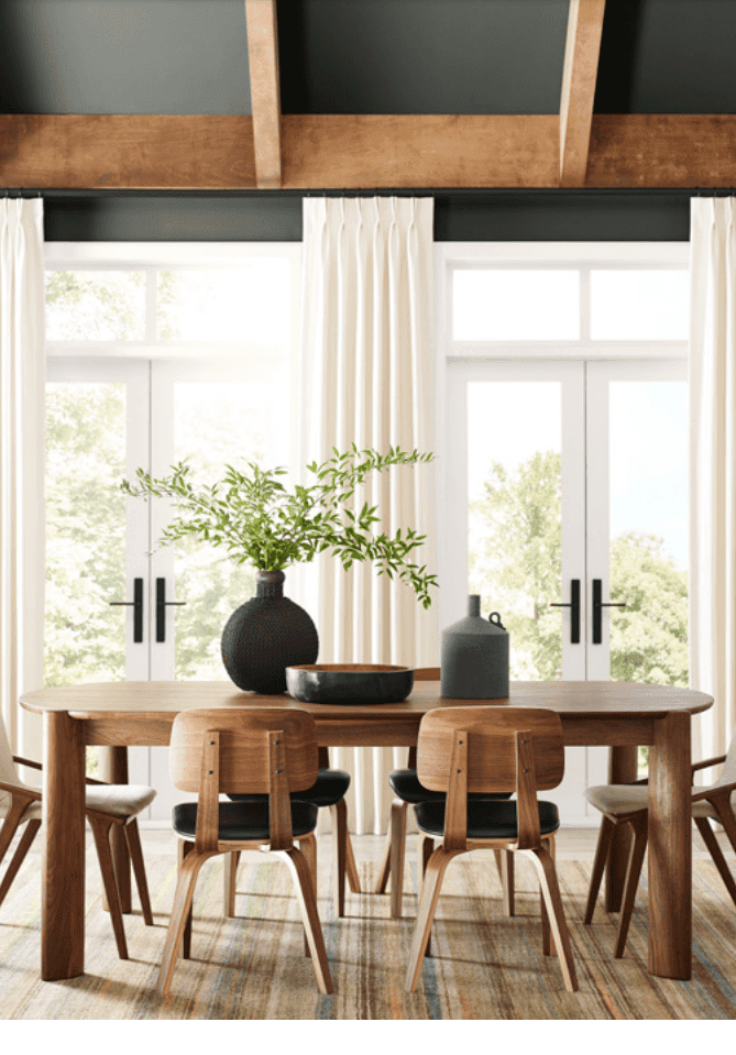
Billiard Green SW 0016
“This velvety deep green is dramatic, lush, and subdued with an understated bluish undertone and plenty of personality.”
Here’s a classic, beautiful, rich green from the Victorian collection of colors. Billiard Green has slight blue undertones and looks great with warm wood tones, tans, and classic black. It has an LRV of 9.
Get a sample >> Billiard Green SW 0016 peel and stick sample
See all the best dark greens here ==> 10 Best Sherwin Williams Dark Green Paint Colors
Aquastone SW 9043
“Vibrant and cool, this bright aquamarine is a stunning and energizing shade reminiscent of the transparent blue-green of its namesake gem.”
This one is a throwback to the 1950’s with it’s retro vibe. It works just as well with a modern or beach house theme and looks great with crisp whites, yellows, and oranges. The LRV is 49.
Get a sample >> Aquastone SW 6043 peel and stick sample
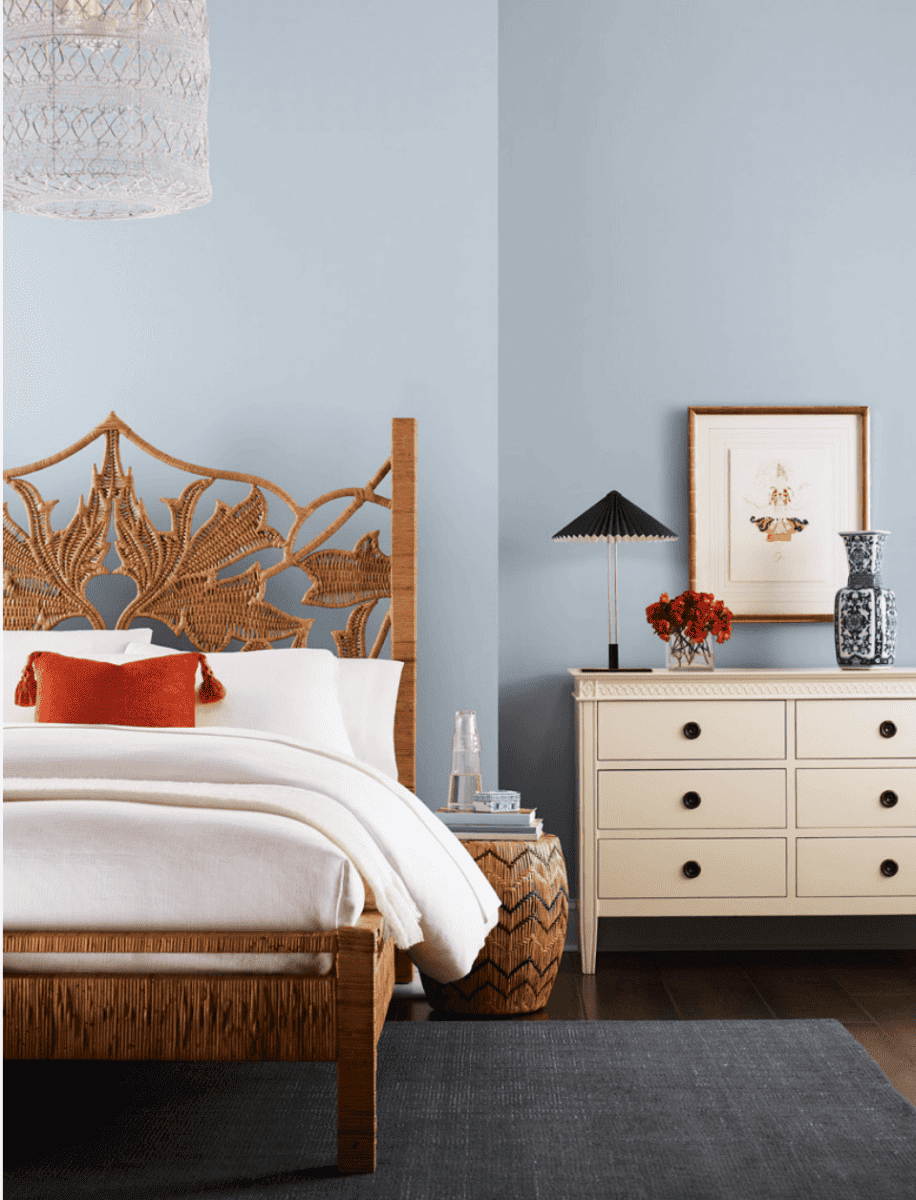
Upward SW 6239
“A color of classic comfort and easy tranquility, this sunny-day blue with calm gray undertones is misty, meditative, and limitless.”
This blue has slight periwinkle and gray undertones and is a wonderful paint color for a bedroom, bathroom, or laundry room. Warm woods, deep orange, and cool whites look amazing with it. The LRV is 57.
Get a sample >> Upward SW 6239 peel and stick sample
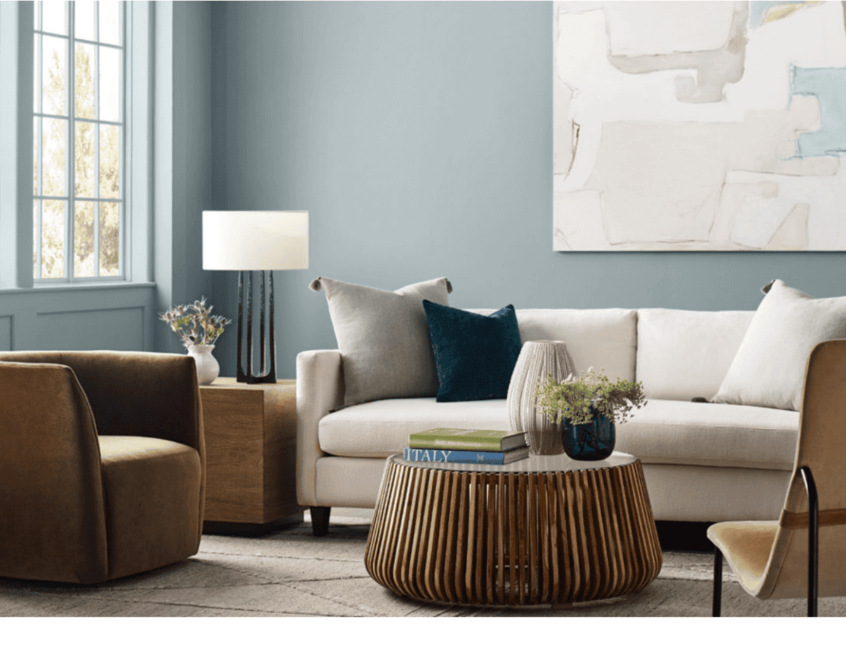
Stardew SW 9138
“This distinctive and dreamy slate blue holds a trace of magic in its bewitching balance of warm and cool undertones.”
With an LRV of 43, Stardew is significantly darker than Upward. It has gray undertones and creates a space that tranquil and relaxing.
Use it with warm woods, deep blue, natural fibers, and greige colors. This is a great color for anyone who loves the “coastal grandmother” style.
Get a sample >> Stardew SW 9138 peel and stick sample
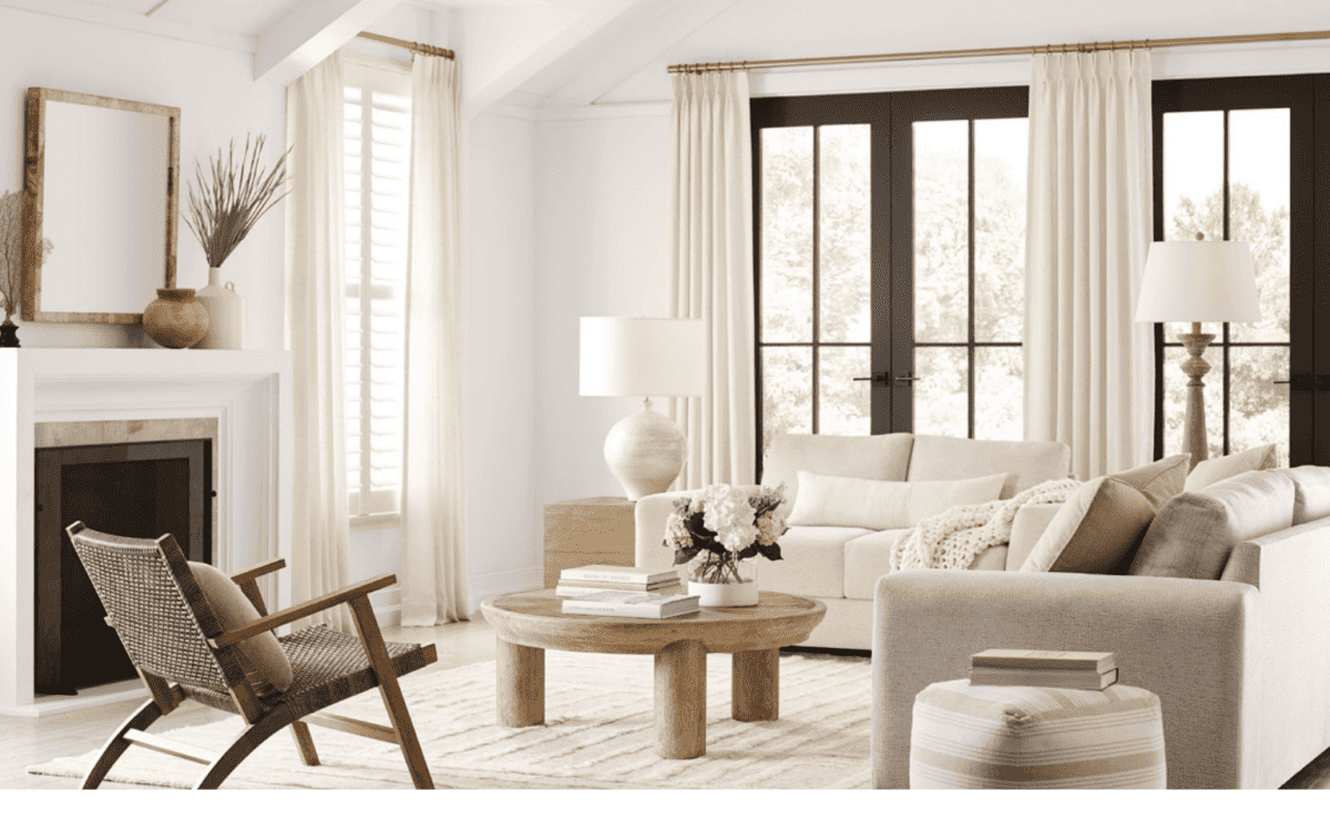
Sherwin Williams 2024 Colors – Delicate Tints
Last but definitely not least is the “Delicate Tints” palette. It’s a safe, fresh palette that is full of warmer whites and neutrals.
These colors are simple, versatile, and adaptable and each one is wonderful backdrop for almost anything you put with them.
“Step away from a world of distractions and demands on the senses. Lend serene sophistication to spaces that invite deep thought and elevated style with the gentlest hint of color – or none at all.“

As you can see, any of the colors could be paired together. It’s a soothing and peaceful palette that would be beautiful with modern, minimalist, or even farmhouse style decor.
Where to use these colors:
These light neutral colors are ideal for common areas like great rooms, hallways, entryways, and are also great for bedrooms, bathrooms, kitchens, and trim. Kitchen cabinets would be a perfect place for any of these.
Grab a free downloadable chart with names at the bottom of this post.

Get the entire collection here: SW 2024 Delicate Tints
- A-Snowbound SW 7004
- B-Heron Plume SW 6070
- C-Egret White SW 7570
- D-Drift of Mist SW 9156
- E-Modern Gray SW 7632
- F-Skyline Steel SW 1015
- G-Sand Dollar SW 6099
- H-Jogging Path SW 7638
- I-Light French Gray SW 0055
- J-Fleur de Sel SW 7666
- K-Silver Strand SW 7057
- L-Silvermist SW 7921
Now let’s take a closer look at some of these calming neutral colors in various spaces.
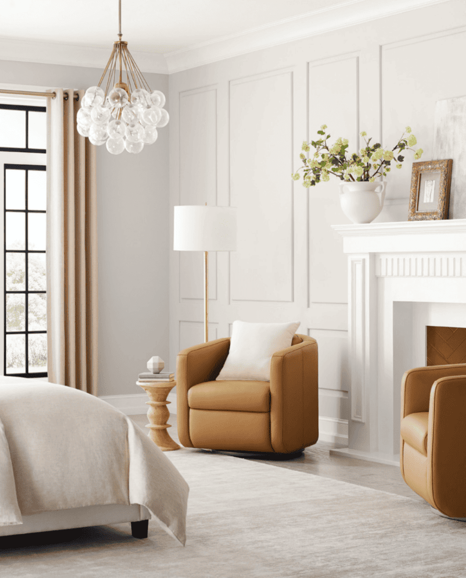
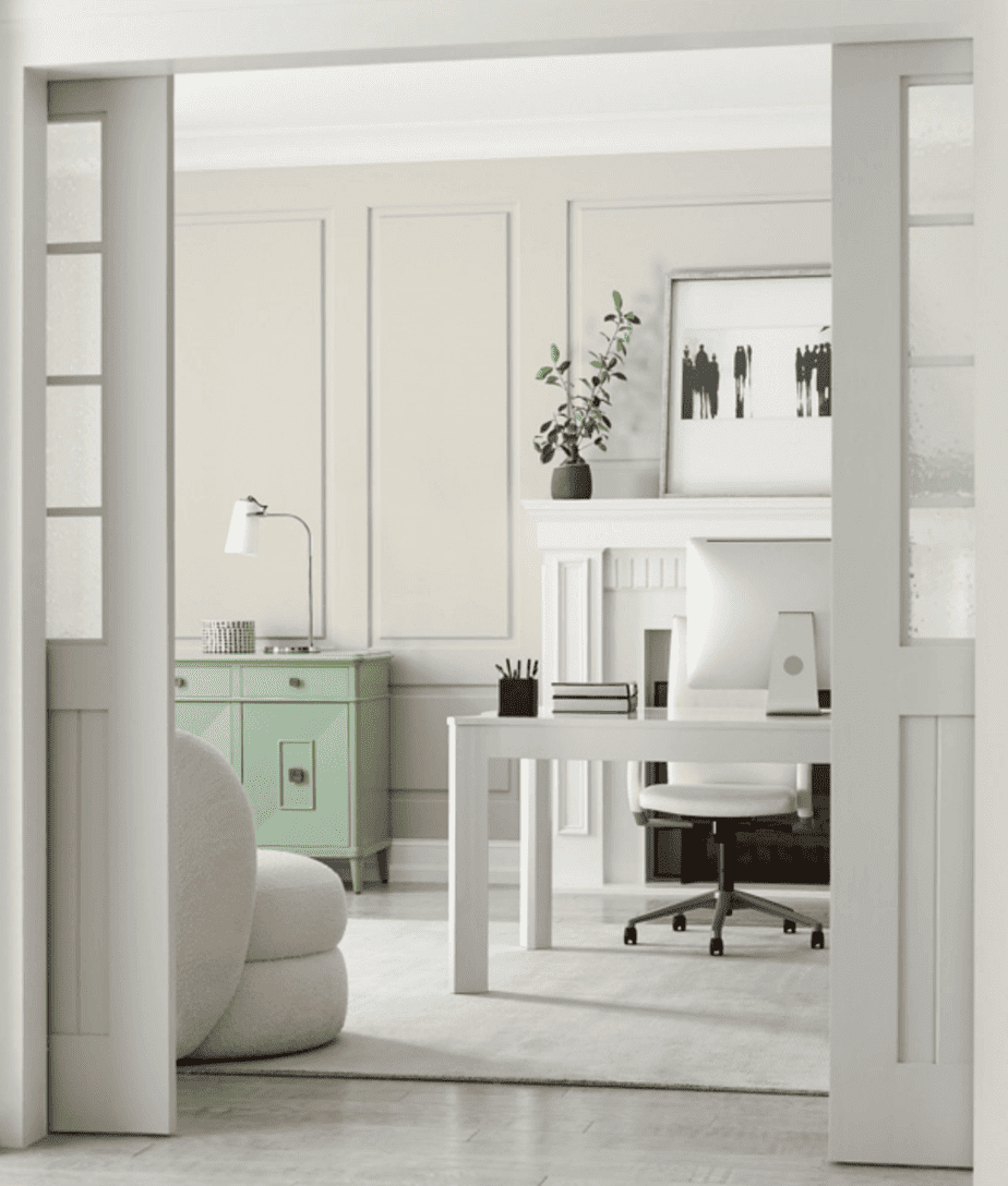
Snowbound SW 7004
“A wintry white with a slight gray undertone, this color is a versatile favorite without being to icy or cold.“
Snowbound is a Top 50 color from Sherwin Williams and is a tried and true favorite of many. It’s in several color collections:
- Sherwin Williams Pottery Barn paint color palette
- Finest Whites
- Living Well (reflect palette)
- Color ID: Minimalist
It’s shown here in a minimalist style living room and looks ideal with the light fabrics, rugs, and natural wood tones.
Get a peel and stick sample here >> Peel & Stick Snowbound SW 7004
Snowbound was the September 2022 Color of the Month for Sherwin Williams and is a best-selling white color.
It has an LRV of 83 and is a the lightest color in the 2024 Color Mix collection. Use it on walls, trim, cabinets, furniture, and exterior siding or trim.
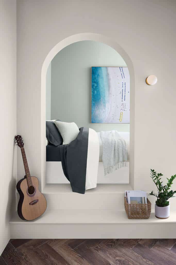
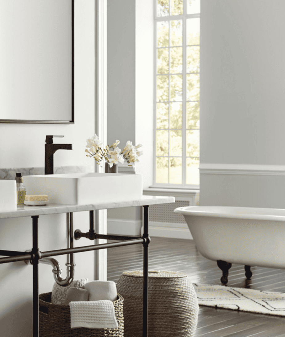
Drift of Mist SW 9156
“A wintry white with a slight gray undertone, this color is a versatile favorite without being to icy or cold.“
Drift of Mist SW 9156 is a Top 50 Color from Sherwin Williams and is loved by many. It has cool undertones and looks best in rooms that face west or south. Accent with warm leather, brass, light wood tones, and cool whites. The LRV is 69.
Get a sample >> Drift of Mist SW 9156 peel and stick sample
My favorite paint brush for the past 20 years is also a favorite of nearly 11,000 amazon reviewers. Grab this affordable and comfortable-to-hold brush here -> MY FAVORITE PAINT BRUSH
Drift of Mist and Silvermist are a match made in heaven as you can see below.
Egret White SW 7570
“Granite undertones add depth to this bright and versatile warm off-white that serves up blissful near-beige tones in low light.”
Egret White SW 7570 is slightly warmer and darker with an LRV of 70. It could be called greige or beige and is very versatile. Crisp whites, blues, and greens are perfect with this hue.
Get a sample >> Egret White SW 7570 peel and stick sample
Skyline Steel SW 1015
“Year after year, this warm stone gray has been forecasted to maintain a spot within our top trend collections.”
If you’re in search of a versatile greige paint color then you’ll want to look at this one. Use it with soft blue or cool sage green colors. It has an LRV of 52.
Get a sample >> Skyline Steel SW 1015 peel and stick sample
Silver Strand SW 7057
“A green-gray tint that feels lighter than air, this hue’s subtle undertones of cool cyan lend a misty quality that freshens anything it touches.”
Silver Strand SW 7057 has a gray-green tint and a calming presence in any room. It’s perfect for a bedroom retreat, dining room, or any space you want to create a minimalist aesthetic. Use it with crisp white, taupe, and light or dark wood tones. The LRV is 59.
Get a sample >> Silver Strand SW 7057 peel and stick sample
Fleur de Sel SW 7666
“This rare delicacy of a tint adds just the right amount of flavor, a hue that is bright with the faintest hint of green undertone.”
For a lighter gray green hue, take a look at Fleur de Sel SW 7666. It has an LRV of 72 and looks nice with crisp white, deep wood tones, and soft accent hues like ivory or a light muted apricot. Best areas to use this color are bathrooms, bedrooms, common areas, and exterior trim.
Get a sample >> Fleur de Sel SW 7666 peel and stick sample
Silvermist SW 7621
“Get lost in this cool mystical blue with its delicate blend of softest green and slate gray undertones.”
Another favorite of mine is Silvermist SW 7621. It’s a soft blue green hue with gray undertones and creates a spa-like atmosphere. Use natural wood tones, blues, and greens with this color. The LRV is 47.

Get a sample >> Silvermist SW 7921
Sand Dollar 6099
“Illuminate any space with warmth and radiance using this lucky-find beige that is as soothing as a seaside morning breeze.”
The warmest color in this palette is Sand Dollar SW 6099. It’s a subtle beige paint color that will add warmth and coziness to any room in your home. Use it with warm whites and dark wood tones for a timeless look. Or go beachy and use vibrant greens and teals with it.The LRV is 58.
Get a sample >>Sand Dollar SW 6099 peel and stick sample

Try a Sample
Always test paint colors before you buy. I use and recommend Samplize Peel and Stick Paint Samples because they’re mess-free painted with two coats of real paint!
If you love paint palettes and color inspiration you’ll want to visit these posts:
- Benjamín Moore White Dove – why it’s a favorite
- Sherwin Williams Alabaster – a classic white
- Sherwin Williams Shoji White Review & Color Palette
- Benjamin Moore Pale Oak
- The 15 Best Beige Paint Colors
- The 15 Best Greige Paint Colors
- The 25 Best Sage Green Colors
- Sherwin Williams Clary Sage Spotlight
- Sherwin Williams Agreeable Gray Spotlight
- Coastal Grandmother Decor & Paint Colors
- 9 No-Fail Neutral Paint Colors from Benjamin Moore
- Best Benjamin Moore Whites & Off Whites
- Best Bedroom Paint Colors
- 13 Gorgeous Interior Door Paint Colors
- 37 Front Door Paint Colors Plus Tips for Choosing One